
Addison & Khan Solicitors
Addison & Khan Solicitors is a real law firm, but this was a self-initiated redesign. Their website felt overwhelming — cluttered layouts, confusing hierarchy, and hard-to-digest content made navigation a headache and reinforced the idea that law is intimidating. I reimagined the design to show how legal services can feel approachable, clear, and easy to use, applying my process to a real-world problem without a client brief.
Pain points before
The original site felt dated and confusing. A messy header and inconsistent typography made navigation hard to follow, while overlayed text on images added little value. Calls-to-action lacked hierarchy, and the cluttered layout buried important information. Instead of building trust, the experience created friction and left users unsure where to go next.


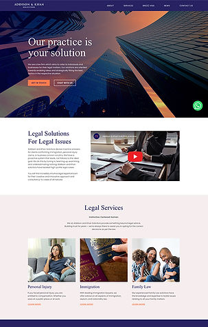
The strategic fix
The redesign focused on clarity and confidence. A cleaner header and larger hero image created a stronger first impression, supported by a clear typographic hierarchy and consistent typefaces. Navigation was simplified, padding increased for readability, and imagery used more strategically. Calls-to-action now guide the journey with purpose, while a streamlined footer and refined brand colors bring balance and cohesion. The result is a professional, approachable site that feels easy to use and inviting to explore.

Wireframe & mockup
Wireframes established a simplified structure and clear content flow, removing friction from the user journey. High-fidelity mockups then brought the vision to life, pairing strong imagery with clean layouts and refined typography to reflect professionalism and trust.


